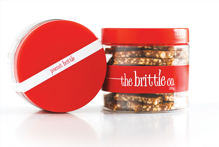
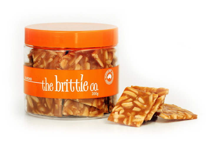
The Brittle Co. branding features eye-catching red paired with a clean white logo and stripe, giving the product a simple, contemporary style that allows the product to shine. The packaging needed to fit right in with the gourmet food market, while also appealing to kids. The logo detail of the snapping letter ‘l’ is a tie in to the product and company name.
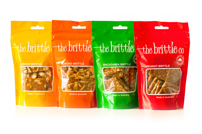
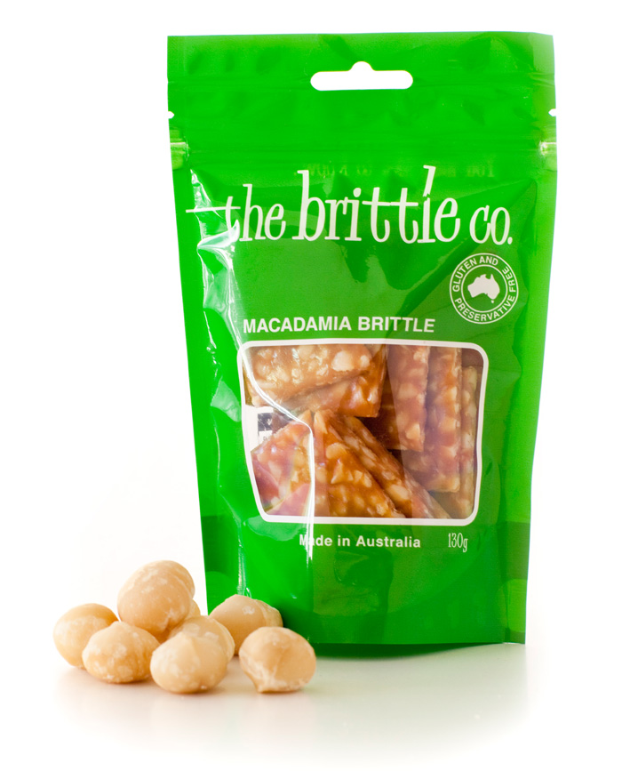
The Brittle Co. very quickly gained distribution in Brisbane, Sydney and Melbourne, ranging from gourmet delis to larger supermarkets. With the expansion of the product range, bold colours were selected to identify each new variety and a larger pouch style of packaging was introduced.
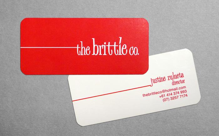
Promotional material including flyers, banner and business cards were also produced for the popular product.